Creative Dispatch / Sep 15, 2026
Inside the Studio: Our Process for Crafting a Standout Identity
A brand identity doesn't arrive fully formed. It gets built slowly, through a lot of questions, some ugly drafts, and a few honest conversations. Here's how we actually work.
It starts with questions, not sketches
Most people picture a designer opening a laptop and drawing a logo. That's rarely where it begins. Before we touch anything visual, we ask a lot of questions, and some of them feel almost too simple. Who is this business for? What does it do that a customer would notice in the first ten seconds? If this brand vanished tomorrow, what would people actually miss? The owner usually knows the answers, but not in words they can put on a page yet. Our first job is to get those answers out of their head and onto the table.
This part isn't glamorous. It's listening, taking notes, and asking the same question twice because the first answer was the polite version. The good answers almost always hide behind the safe ones.
We look around before we look inside
Then we study the field. What do the competitors look like? Where does everyone in this industry tend to sound the same? A coffee roaster and a law firm fall into different habits, but inside each group you start to see the copycat patterns. We aren't looking to copy them. We're looking for the gap, the corner nobody has claimed yet. Sometimes the single most useful thing we find is a cliché we can all agree to avoid.
The middle is messy on purpose
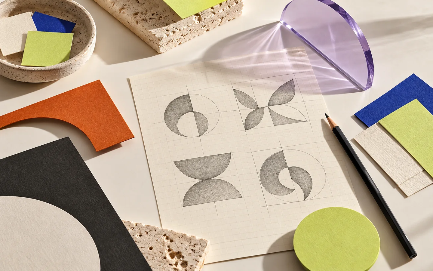
After the research comes the part clients sometimes worry about, because it looks chaotic. We draw too many ideas. We pin up directions that are too safe, too strange, and occasionally too good to be true. This is the stage where it's easy to think something has gone wrong. It hasn't. A strong identity almost never shows up on the first pass. You find the right one by pushing the wrong ones out of the way.
We try to show fewer ideas than we made, not more. Ten half-baked options freeze a decision. Three real ones, each with a point of view, make it possible to react. And how you react, even when you say you don't like something, tells us a lot.
We test it in the real world, not on a clean screen
A logo can look perfect on a white artboard and fall apart the moment it lives anywhere real. So we put the work where it actually has to survive. On a phone at 2am. On a shop sign across a busy street. On a bill, a delivery bag, a tiny app icon, a staff t-shirt. If the idea only works when everything is neat and large, it isn't an identity yet. It's a picture of one.
This is also where a name earns its keep. A brand that's hard to spell, say, or remember will quietly lose customers at the door, and no amount of careful design fixes that.
We hand over a system, not a folder
When the direction is settled, we don't just email a few files and shake hands. We leave the business with a small set of rules: the colours and what each one is for, the typefaces and where they belong, how much space to keep, how the brand talks, and what not to do. Good guidelines are the difference between a brand that stays itself for five years and one that drifts into a mess the first time someone new makes a poster.
What we wish every client knew
You don't have to come in with the answers. You just have to come in with the truth. The more honest you are about who you serve, what you charge, and where you want the business to go, the better the work gets. A brand built on a careful fiction looks fine for a season and then stops fitting. A brand built on something real has room to grow into.
The honest truth is that a standout identity isn't one clever thing. It's a lot of small, unglamorous decisions made on purpose and kept consistent long after the exciting part is over. That's the part nobody sees, and it's the part that works.