Creative Dispatch / Sep 22, 2026
Why Every Brand Needs a Signature Visual Language
A logo is one piece of a much bigger picture. What makes a brand feel familiar is the quiet set of visual habits wrapped around it. Here's why that matters, and how to build it.
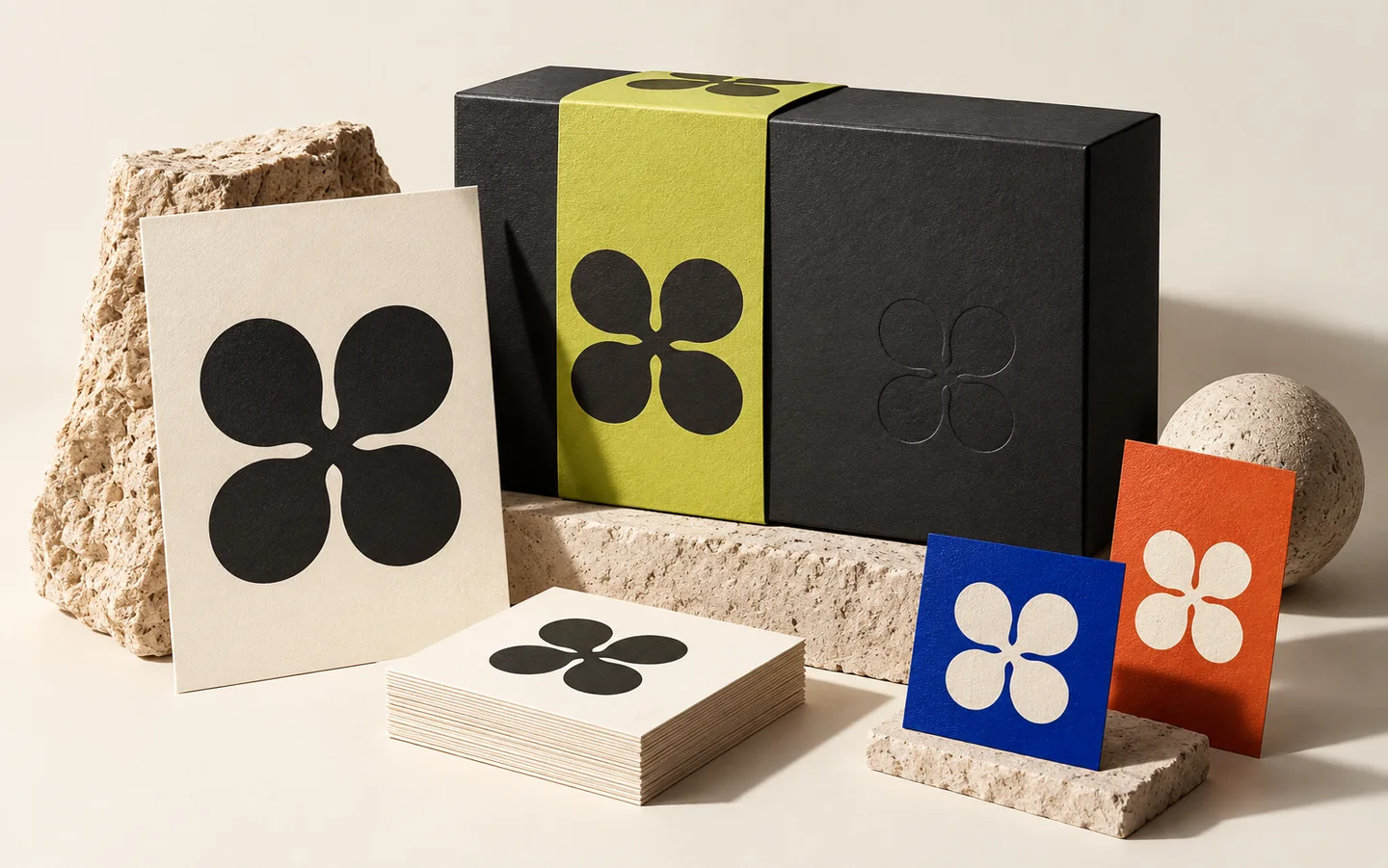
Think about how you spot a friend's message before you even open it, just from the shape of their words or the way they use punctuation. Or how you know your regular shop from across the road before you can read the sign. You aren't noticing a logo. You're noticing a pattern of small visual cues your brain has quietly learned. Brands work exactly the same way. The reason some of them feel familiar isn't one clever mark. It's a whole language of choices that keep repeating.
One logo isn't enough to be remembered
A lot of businesses spend real money on a logo and then treat it as the finish line. But a logo sitting alone on a white page does very little. What people actually see, over and over, is the colour around it, the font in the headings, the spacing, the kind of photographs, the shape of the buttons, the way the text talks. Take any brand you admire and cover up the logo. You can usually still tell who it is. That's a signature visual language doing its job.
What the language is made of
It's simpler than it sounds. A small, deliberate set of parts, each one used the same way every time.
Colour. Not just a palette, but rules for where each colour shows up and how much you use at once.
Type. A heading voice and a body voice, so your text has a tone before anyone reads a word of it.
Space and rhythm. How crowded or calm things feel. Two sites with the same colours can look completely different just because one gives its ideas room to breathe.
Shape and detail. Are corners sharp or soft? Are photos bright and candid, or moody and still? Small habits like these add up to a feel.
Voice. How the brand words things. A playful line and a serious line can sit inside the same design and pull it in opposite directions.
None of this has to be loud. The best versions are almost invisible. They just stay the same.
Try this on your own brand
Pull up your last five posts, your website, and anything you printed recently, and put them side by side. Do they look like they came from one place, or like five different businesses that happen to share a name? If the second one sounds familiar, you don't have a language yet, just a logo and good intentions. That gap is normal, and most small brands live in it. Closing it doesn't need a huge budget. It needs you to decide on a few rules and then keep them, even when it's easier not to.
Why it quietly earns trust
Consistency does something to people. When everything you put out looks and sounds like it belongs together, it feels settled and dependable, like a place that will still be there next year. When it drifts, people notice, even if they can't say why, and the brand starts to look unsure of itself. Trust is rarely won by one bold campaign. It's built by a hundred small moments that all feel the same.
That's the whole point of a signature visual language. It isn't about looking fancy. It's about being recognisable enough that people stop having to wonder whether you're the real thing.